Typography & Psychology: How Fonts, Spacing, and Text Structure Influence Trust, Safety, and Perception of Therapy
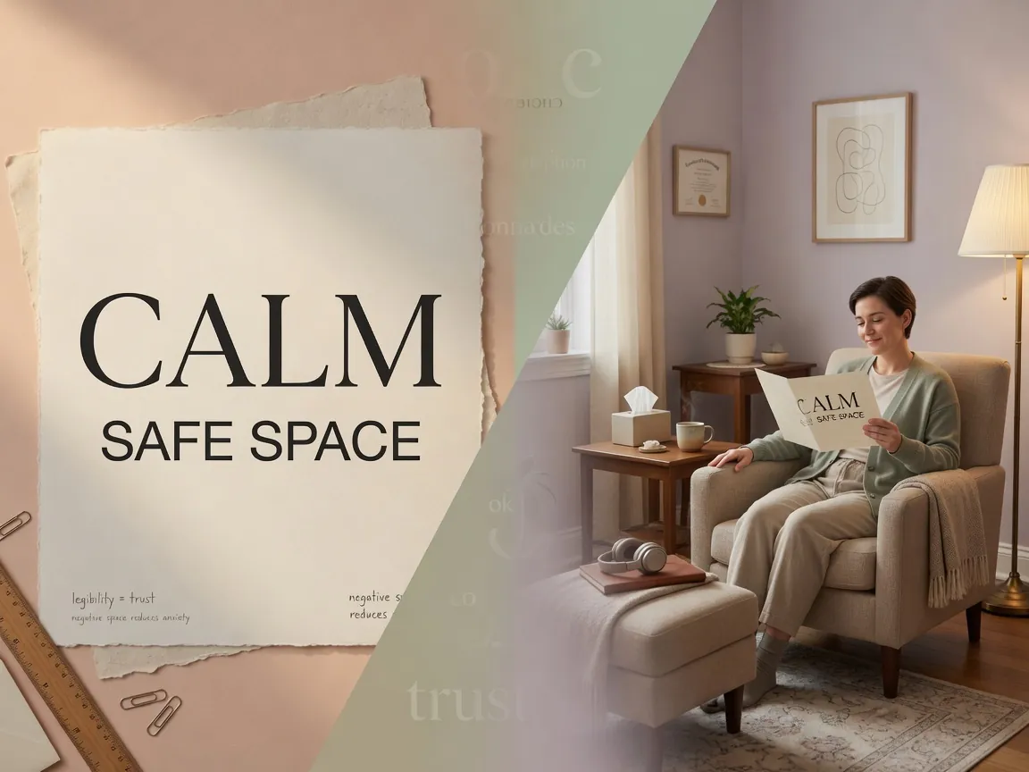
| Essence | The visual organization of text — fonts, spacing, structure — directly influences the reader's emotional state, level of trust, and sense of safety |
|---|---|
| Areas of Application | Psychologist websites, therapeutic materials, written practices, informed consent forms, client correspondence |
| Scientific Basis | Cognitive psychology, text perception research (Larson, 2004; Bringhurst, 2004; Shaikh & Chaparro, 2004), neuroaesthetics |
| Key Takeaway | Good typography reduces cognitive load, increases trust, and creates a sense of care — even before the first contact with the therapist |
When a person searches for a psychologist, they evaluate not only diplomas and methods. Long before the first call, the client forms an impression — and a significant part of this impression is formed by how the text looks. The font the website uses. The distance between lines. How easy it is to scan the description of an approach. These factors work on a pre-verbal, almost unconscious level — and modern cognitive science confirms: they are not indifferent.
Typography in the context of psychotherapy is not a matter of aesthetics. It is a matter of safety, trust, and accessibility. In this article, we will examine exactly how the visual organization of text affects the client, provide practical examples, and show which research can be relied upon.
1. Fonts: The Emotional Temperature of Letters
Serif and Sans-Serif: What Science Says
Fonts are divided into two broad classes: serif (e.g., Times New Roman, Georgia, PT Serif) and sans-serif (e.g., Arial, Helvetica, PT Sans, Inter). Serifs are small protrusions at the ends of letter strokes. A small detail, it would seem. But research shows that readers consistently attribute different psychological characteristics to these classes.
| Characteristic | Serif | Sans-Serif |
|---|---|---|
| Associations | Tradition, stability, academic, reliability | Modernity, clarity, accessibility, friendliness |
| Emotional Temperature | Warm, «human» | Neutral, «instrumental» |
| Perceived Text Complexity | Text seems more «serious,» sometimes more complex | Text seems simpler and more accessible |
| On-Screen Readability | Good at large sizes and high resolution | Better at small sizes and low resolution |
| Examples of Use in Therapy | Printed materials, certificates, books | Websites, email newsletters, online journals |
In a study by Shaikh & Chaparro (2004), participants were shown texts set in different fonts and asked to rate them on scales of «friendliness,» «professionalism,» «reliability.» The result: serif fonts were consistently perceived as more professional and stable, while sans-serif — as more friendly and modern. Moreover, no font was «bad» — everything depended on context.
What This Means for a Psychologist
If a psychologist's website uses a sans-serif font like Arial — it is perceived as more accessible, «closer to the person.» If the same text is set in PT Serif — it seems more academic, «serious.» Neither option is wrong, but they send different signals. A trauma psychologist may want to create a sense of stability and tradition (serif). An ACT therapist or coach — modernity and clarity (sans-serif).
What Definitely Not to Do
- Decorative fonts (Comic Sans, Lobster, handwritten) — reduce perceived professionalism. Research shows that Comic Sans is perceived as «frivolous» and «childish» (Shaikh, 2007).
- Mixing more than 2 fonts on one page — creates visual noise and a sense of chaos, which directly contradicts the goal of creating a safe space.
- Too small a font size (less than 14px on screen) — increases cognitive load and may be perceived as disregard for the reader.
2. Spacing and Rhythm: The Psychology of «Air»
Line Spacing and Anxiety
Line spacing (leading) — the distance between lines of text — is one of the most underestimated parameters. In web typography, the standard is 1.4–1.6 of the font size. This is not a random number: readability research shows that overly tight text (1.0–1.2 spacing) causes a sense of constriction and tension, while overly loose text (above 2.0) — fragments perception and makes it harder to link lines into meaningful blocks.
| Line Spacing | Visual Sensation | Psychological Effect |
|---|---|---|
| 1.0–1.2 (tight) | Lines «crawl» onto each other | Anxiety, rush, feeling of overload |
| 1.4–1.6 (optimal) | Comfortable breathing of text | Calm, clarity, invitation to read |
| 1.8–2.0+ (loose) | Lines «float» separately | Loss of coherence, difficulty in comprehension |
Line Length: Why It Matters for Safety
The optimal line length for comfortable reading is 45–75 characters (including spaces). This is not an arbitrary recommendation: it is based on the physiology of the oculomotor system. With a line that is too long (90+ characters), the eye has more difficulty finding the beginning of the next line — this increases fatigue and can cause frustration. With a line that is too short (less than 35 characters) — reading becomes choppy, staccato.
For a client with heightened anxiety or PTSD symptoms, whose cognitive resources are already partially occupied by hypervigilance, every extra barrier in reading is additional stress. Comfortable line length is not a designer's whim, but an element of care.
Paragraphs and «Air»
Short paragraphs (3–5 lines) with spacing between them create a rhythm that is perceived as predictable and safe. Long «bricks» of text without visual pauses, on the contrary, can evoke a sense of being overwhelmed — especially in clients with depressive symptoms, for whom any task seems insurmountable. Breaking text into small, manageable fragments is a form of visual containing: «this piece can be handled.»
3. Structure and Visual Hierarchy: Predictability as Safety
Why Headings Matter for Trust
Cognitive psychology knows the phenomenon of processing fluency: the easier it is for the brain to process information, the more positively it is evaluated and the higher the trust in its source (Reber, Schwarz & Winkielman, 2004). Well-structured text with clear headings, subheadings, and uniform formatting is processed faster — and therefore evokes more trust.
For the therapeutic context, this means: if a client opens an informed consent form or a description of a method and sees a logical, predictable structure, their baseline anxiety decreases. The brain receives a signal: «this is understandable, this is organized, one can orient oneself here.»
Visual Hierarchy: What It Is and Why
Visual hierarchy is the organization of elements on a page so that the reader instantly understands what is primary and what is secondary. It is built through:
- Size — the heading is larger than the subheading, the subheading is larger than the body text;
- Weight — bold for key concepts;
- Color — an accent color for the most important;
- Space — margins separating semantic blocks.
When hierarchy is disrupted — for example, all elements are the same size and weight — the reader experiences cognitive discomfort: it's unclear what to «grab onto,» where to start. For a person in a state of stress or anxiety, this can become a trigger for avoidance: «too complicated, I won't bother.»
| Element | Good Practice | Why It Works |
|---|---|---|
| H1 Heading | One per page, the largest | Instantly communicates the topic; reduces uncertainty |
| H2–H3 Subheadings | Logical nesting, consistent style | Creates a «map» of the text; can be scanned by eye |
| Key Terms | Bold highlighting | Helps quickly find the main points on re-reading |
| Lists | Bulleted or numbered | Break information into discrete, manageable units |
| Quotes / Key Thoughts | Separate block with background or border | Signals: «this is worth remembering» |
4. Color and Contrast in Therapeutic Materials
Contrast and Accessibility
Contrast between text and background is not only a matter of readability but also a matter of inclusivity. According to the WCAG 2.1 standard (Web Content Accessibility Guidelines), the minimum contrast ratio for body text is 4.5:1. Gray text on a light gray background (popular in minimalist design) often falls short of this threshold.
For clients with depressive symptoms, who often have reduced concentration ability, low contrast is an additional barrier. For elderly clients — a physical obstacle. Black text on a white background (or very dark gray #222 on #fff) remains the gold standard of readability.
Color Accents and Emotional Tone
Colors evoke stable emotional associations, and this is confirmed by cross-cultural research (Elliot & Maier, 2014):
- Blue — calm, trust, professionalism. The safest choice for a psychologist's website.
- Green — growth, health, balance. Good for self-help materials.
- Warm tones (beige, cream) — create a sense of coziness, «human» contact.
- Red — in large quantities can increase anxiety; use sparingly.
Important: color accents should not be the only way to convey information. A color-blind client won't distinguish a red button from a green one if they are not labeled. This is a matter of accessibility and respect.
5. Practical Example: A Psychologist's Website «Before and After»
Let's consider a hypothetical but recognizable example. Psychologist Anna works with anxiety disorders using the CBT approach. Her website contains a description of the approach, education information, and a booking form.
Version A: «Unsafe» Typography
- Font: Times New Roman, 13px — association with official documents, not with care;
- Line spacing: 1.2 — text is «compressed,» hard to read;
- Line length: ~100 characters — the eye gets lost when moving to a new line;
- Text color: #777 on white background — contrast 4.3:1, borderline;
- Headings: same size as text, only bold — no hierarchy;
- Paragraphs: 10–12 lines each, without visual pauses.
What does the client feel? Even without realizing the reasons — tension, a desire to close the page. The text is perceived as «complex,» and the specialist — as «bureaucratic.» Cognitive load is high, trust — low.
Version B: Safety-Supporting Typography
- Font: PT Sans, 16px — modern, friendly, readable;
- Line spacing: 1.6 — text «breathes,» lines don't stick together;
- Line length: ~65 characters — comfortable reading rhythm;
- Text color: #222 on #fff — contrast 15.4:1, excellent readability;
- Headings: H2 — 24px, H3 — 18px, clear hierarchy;
- Paragraphs: 3–4 lines each, with 1rem spacing between them.
What does the client feel? The text is perceived as «light,» «understandable.» The specialist seems more accessible and caring — although the content of the text hasn't changed. Only its visual organization has.
6. Typography in Therapeutic Materials: Special Cases
Informed Consent
Informed consent is a legally significant document that the client must understand, not just sign. Research shows that the level of understanding of medical and therapeutic documents directly depends on their readability (Nielsen-Bohlman et al., 2004). Recommendations:
- Font size no smaller than 12pt in print, 16px — electronic;
- Clear structure with subheadings («Confidentiality,» «Duration,» «Payment»);
- Short sentences and paragraphs;
- Bold highlighting of key commitments — both the therapist's and the client's.
Written Practices and Homework
If you give a client a printout with a thought diary (CBT), a desensitization protocol, or a grounding technique — the typography of these materials is critical. The client often turns to them in a state of stress. Small font, tight layout, absence of visual cues — all of this raises the barrier to use. Good practice:
- Leave blank lines for writing — wide enough to write by hand;
- Use borders and backgrounds to separate instructions from fill-in fields;
- Number steps if the practice is multi-step;
- Add a filled-in example — this reduces the anxiety of «I'm doing it wrong.»
Materials for Clients with Special Needs
Clients with dyslexia (by various estimates, 5–10% of the population) deserve special attention. For them, it is recommended:
- Sans-serif fonts (Arial, Verdana, special fonts like OpenDyslexic);
- Letter spacing slightly wider than usual;
- Cream or light beige background instead of pure white — reduces visual stress;
- Avoid italics and ALL CAPS for long passages.
7. Scientific Foundations: What We Know and What We Don't
What Is Confirmed by Research
- Processing fluency and trust: Reber, Schwarz & Winkielman (2004) showed that visually «easy» stimuli are evaluated as more true and evoke more trust. This is directly applicable to text on a psychologist's website.
- Font perception: Shaikh & Chaparro (2004) and Shaikh (2007) — stable differences in perception of serif and sans-serif on scales of «professionalism,» «friendliness,» «reliability.»
- Readability and comprehension: Bringhurst (2004) in the classic work «The Elements of Typographic Style» summarized a century of book typography experience; many of his recommendations are confirmed by modern eye-tracking research.
- Color and emotions: Meta-analysis by Elliot & Maier (2014) confirms stable cross-cultural associations of color and emotional states.
What Is Not Proven and Requires Caution
- «Therapeutic font»: there is no font that «heals» or «reduces anxiety.» There are fonts that don't add extra cognitive load — and that's all that can be claimed.
- Color therapy through text: the idea that blue text calms and red activates does not have reliable confirmation in the context of reading. Color effects depend on area, context, and individual differences.
- Fonts for dyslexia: special fonts (OpenDyslexic, Dyslexie) have an ambiguous evidence base. They may help some readers but are not a panacea (Wery & Diliberto, 2017).
8. Practical Recommendations: A Checklist for Psychologists
| Parameter | Recommendation | Why |
|---|---|---|
| Font | One serif or sans-serif, no decorative | Reducing visual noise, increasing professionalism |
| Font Size (screen) | 16–18px for body text | Comfortable reading without eye strain |
| Line Spacing | 1.4–1.6 | Balance between density and «air» |
| Line Length | 45–75 characters | Physiologically comfortable rhythm of eye movement |
| Contrast | At least 4.5:1 (dark text on light) | Accessibility, readability, inclusivity |
| Paragraphs | 3–5 lines, with spacing between them | Visual containing, reducing the sense of being overwhelmed |
| Headings | Clear hierarchy H1 → H2 → H3, consistent style | Predictability, ease of scanning |
| Emphasis | Bold for key words; avoid italics for long passages | Accent without loss of readability |
| Lists | Bulleted for enumerations, numbered for sequences | Structuring information into manageable units |
9. Beyond the Screen: Typography as a Metaphor for Therapy
There is a deep, though not rigorous, parallel between good typography and good therapy. A good typographer does not shout at the reader with huge letters and does not whisper in microscopic font. They create a space in which the reader is comfortable: enough air, clear structure, nothing distracts from the content.
A good therapist does the same: does not pressure, does not disappear, creates a safe and predictable space in which the client can explore their inner world. Typography is not just design. It is a non-verbal message: «I took care to make you comfortable. Even before you said your first word.»
Book a Consultation
You can discuss how EMDR therapy can help in your situation during a free 15-minute consultation. Message us: